Selection lists
Selection lists are the contents of the dropdown menus in the different modules, with which the data set are e.g. grouped. The selection lists ensure that always the same designations are used for a group and the data set can be filtered thereby easily.
In ingenious, the most selection lists are administrated by the user him/herself, who can thereby determine the individual content of the drop-down menus.
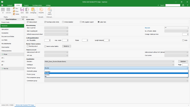 |
| Example selection list in the article data |
 |
| Configuration of the selection list e.g. the segment group |
In the program settings / selection lists, the following functions are available via the toolbar:
| Deletes the marked value from the selection list | |
| Opens a separate window for configurating the sidebars for the single modules. |
The administration of selection lists
For adding a new value into a selection list, it is first selected via the drop-down list “module” and “entry”, which value list shall be modified. All already existing values of that list are then displayed in a table.
The new entry is written in the field “text” and confirmed with the “enter” or “return” key on the keyboard.
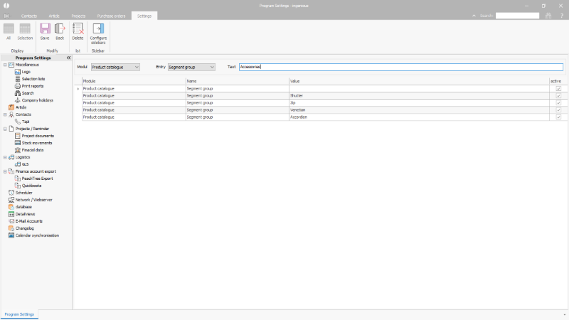 |
| Adding a selection list entry |
Adding the entry can be stopped or confirmed via “yes” or “no” in the following security query.
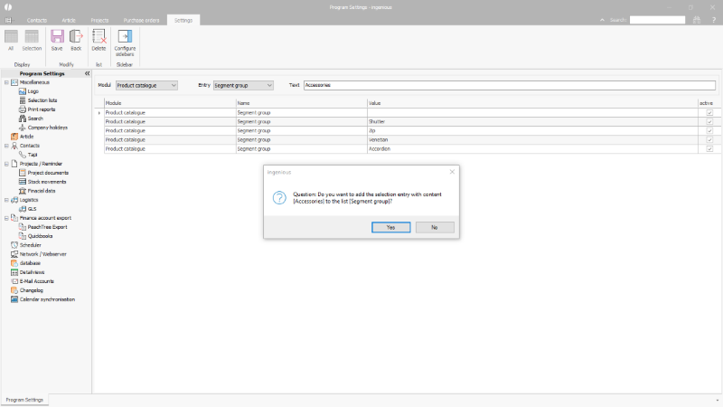 |
| Confirmation of the addition |
Disable a selection list entry
Via the checkbox behind every selection list entry in the table. singular values from the selection list can be disabled. A disabled value is not available for the modification of a data set. Data sets, who have been assigned to this value before it has been disabled, keep it and can still be filtered accordingly.
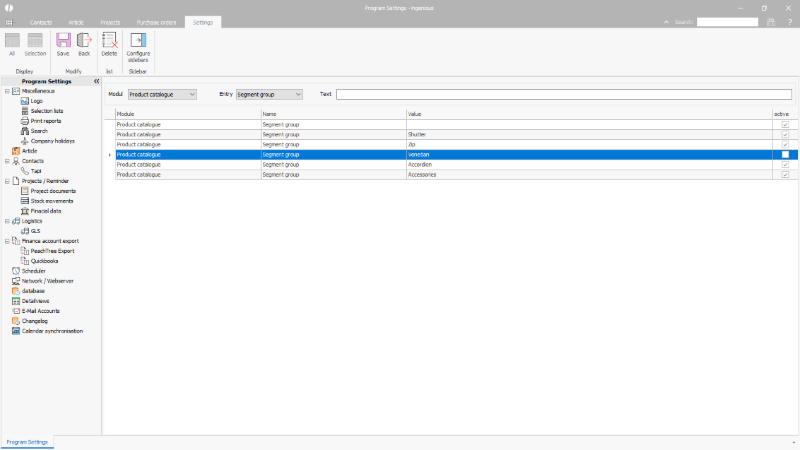 |
| Disabled selection list entry |
Delete a selection list entry
Via the ![]() button in the toolbar, a marked selection list entry can be deleted. With the confirmation of the security query, the entry is deleted ultimately.
button in the toolbar, a marked selection list entry can be deleted. With the confirmation of the security query, the entry is deleted ultimately.
At the same time, the assigned value in the single data sets is deleted, too.
 |
| Deletion of a selection list entry |
Change the name of a selection list entry
Existing selection list entries can be overwritten with new values. Doing so, the value to be changed is selected via a double-click. The previous value is adopted in the field “text” an can be overwritten as required. After using the “enter” or “return” key of the keyboard, a security query appears. Through confirming the dialog the changes are adopted.
The values already assigned to data set are adjusted as well.
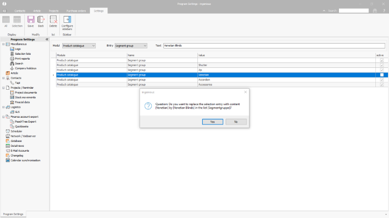 |
| Changing the name of a selection list entry |
Add a selection list entry to the drop-down menu
Selection list entries can also be added directly to a self-managed selection list if the user has the corresponding user right (1000300 – System functions – Extend selection lists).
At the end of the selection list is the entry “*Create new entry”.
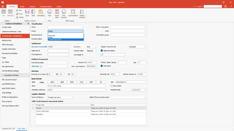 |
| Add a selection list entry |
Clicking this opens a form where the new entry can be entered.
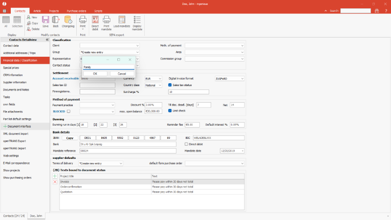 |
| Name a new selection list entry |
After confirming with OK, the entry will be added to the current record and the global selection list.
Configurate sidebars
The sidebars are individual form templates, which can be displayed in the miscellaneous data of the detail views of the four main modules “contacts”, “articles” and “projects” and “purchase orders” and their positions. In the templates, often applied mistakes of other navigation points and own defined fields can be displayed and modified.
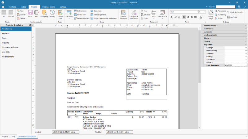 |
| Example sidebar in the projects detail view |
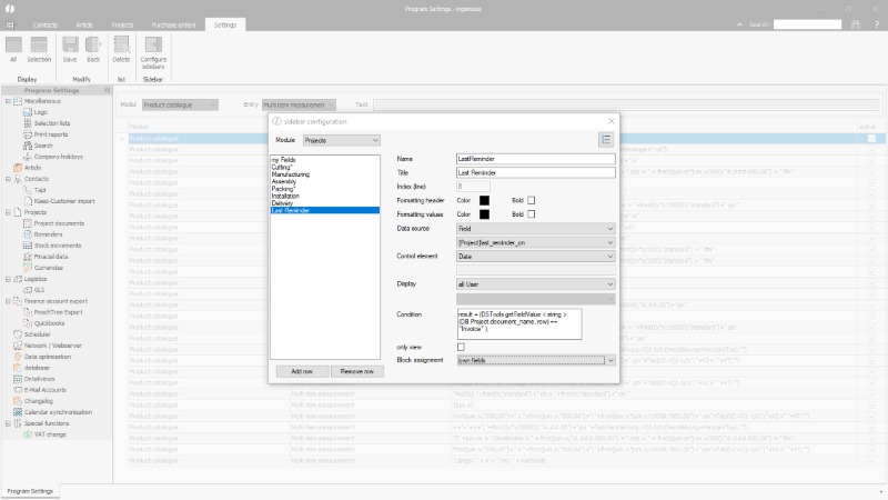 |
| Example configuration of a sidebar for projects |
In the sidebar configuration, the following parameters and functions are available:
| Module | Selection list | Selection of the module, of which the detail view shall be displayed in the sidebar. | ||||||||||||||||||||
| List | Listing of all already defined rows in the sidebar; via drag&drop their order can be modified. | |||||||||||||||||||||
| Add row | Button | Adds a new row to the sidebar. | ||||||||||||||||||||
| Remove | Button | Removes the marked row from the sidebar. | ||||||||||||||||||||
| Name | Simple input field | Distinct internal name of the sidebar row (must be unique). The automatically assigned name can be kept. | ||||||||||||||||||||
| Title2 | Simple input field | Designation of the field, which is shown to the user in the sidebar. | ||||||||||||||||||||
| Index (line) | Disabled field | Consecutive numbering of the rows according to their defined order. | ||||||||||||||||||||
| Formatting header | Options for highlighting of the designation of the singular rows. Via the color fields, the font color can be selected; if the checkbox is activated, the designation is printed in bold letters. | |||||||||||||||||||||
| Formatting values | Options for highlighting of the values of the singular rows. Via the color fields, the font color can be selected; if the checkbox is activated, the value is printed in bold letters. | |||||||||||||||||||||
| Data source | Selection list |
|
||||||||||||||||||||
| Control element | Selection list |
|
||||||||||||||||||||
| Display | Selection list |
|
||||||||||||||||||||
| Condition | simple input field | A condition in macro language can be added here. This determines in which case the respective line should be displayed in the sidebar.
In the following example, the field is only displayed for project documents named “Offer”: result = (DSTools.getFieldValue < string > (DB.Project.document_name, row) == “Offer” ); |
||||||||||||||||||||
| only view | Checkbox | For activating that the values of this row cannot be modified but are only displayed. | ||||||||||||||||||||
| Block assignment | Selection list | The block assignment can be used to determine in which block of the project sidebar the respective line of the individual sidebar entries should be displayed. The “Own fields” block is standard. Individual sidebar lines are added at the bottom within the predefined blocks. |
The order of the sidebar blocks can be changed for the projects and purchasing modules using the button ![]() .
.
The individual blocks can be pushed up or down using the arrow keys.
 |
| Positioning of the sidebar blocks |

